More than precious metal, silver is center stage in the palettes and mood boards of interior designers and influencers alike at the moment. Evolving from a form of currency into the key ingredient in decorative treasures like tableware and jewelry, silver has long cemented its status into our creative vocabularies.
Now, as we see the resurgence of cooler color palettes and y2k-inspired interiors, we’re starting to rediscover a trove of colors that go with silver. Part of what makes this color so intriguing is its ability to reflect light around the room while maintaining an effortless air of cool. It can, however, be intimidating to consider who best to bring silver into synchronicity with the rest of the room.
As with the colors that go with gold, silver is somewhat of a neutral, but there are certain pairings that just work. We asked some of the world’s foremost interior designers for their secrets when it comes to making silver schemes cohesive and captivating.
1. Cream
(Image credit: Dallas & Harris Photography, Design: Aspen Design House)
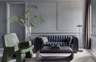
When in doubt, decorating with neutrals is always a safe bet when it comes to crafting your color scheme. Colorado-based studio, Aspen Design House let silver sing in this living room design. Accents of the reflective hue are found not just in the distinctive coffee table but in each corner of this space, from the picture frames to the sideboard details. The effect is a modernizing touch that tempers the warmth and comfort of this space.
“In this room, the silver is so shiny it’s a mirror,” says Denise Taylor, founder and design director of Aspen Design House. “The chunky legs of the natural live-edge wood coffee table are wrapped in a silvery mirror that gives the illusion that the coffee table is floating in the room as it reflects the rug and all the furniture around. This room has rich hues of camel, cream, blue, and black that complement the silver perfectly. Any shade of blue also works well with silver and is perfect for pops of color against the more neutral tones.”
2. Earth tones

(Image credit: David Duncan Livingston, Design: Heather Hilliard Design)
The obvious but impactful choice, silver is a cool character, and therefore complementary colors that accentuate this trait are an easy and effective choice. Earth tones might sound like a contrast to silver too far, but if you follow in the footsteps of this contemporary San Franciscan space designed by Heather Hilliard, founder of Heather Hilliard Design, it can work in a sophisticated way.
Heather opted for muted shades of green and purple that connect to the depth of the patinated silver furniture and lighting in this earth tone living room. “Cool earth tones and darker hues can be a nice foil to silver or chrome, allowing the reflective quality to add to a moody atmosphere,” says Heather.
3. Red

(Image credit: David Duncan Livingston, Design: Niche Interiors)
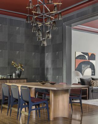
As it sits very close to another new neutral, silver is also very good at working with louder colors that go with gray, like red, ochre, or orange. A case in point is found in this mesmerizing dining room created by Niche Interiors, where the punchy ceiling and upholstery give the silver a sense of levity and an equal dose of drama.
“Gray and silver tones are versatile neutrals that can be used with an endless variety of colors,” Jennifer Jones, Principal Designer of Niche Interiors, tells us. “In this dining room, we paired a graphic gray wallpaper and smoked glass chandelier with an oxblood red ceiling for a dramatic wow factor. Darker greys will pop next to warm, saturated colors such as ochre and red.”
4. Green

(Image credit: Vincent Desailly, Design: Berenice Curt Architecture)
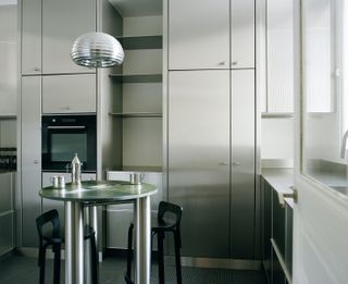
French architect and interior designer, Berenice Curt, founder of Berenice Curt Architecture, does more than make silver the stand-alone feature in her latest kitchen design. The compact dining table that sits in the center of the room is covered in a verdant green stone that cleverly gives the space a kind of contemporary softness. It doesn’t fight the stainless steel kitchen, but simply echoes their light and elegance.
“Pairing green with silver creates a striking contrast between the natural and the industrial,” says Berenice, of this color that goes with green. “The green evokes the essence of nature, bringing warmth and life to a space, while the raw, metallic finish of silver or stainless steel adds a sleek, modern edge. This combination balances organic softness with an industrial touch, resulting in a harmonious yet dynamic room design.”
5. Brown

(Image credit: Kate Jordan, Design: Gretchen Farrell Interiors)
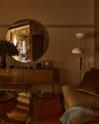
Interior designer Gretchen Farrell, founder of Gretchen Farrell Interiors, presents an alternate reality for silver in her mid-century ranch project. This is a world in which this precious metal is paired with rich buttery brown hues that give it an undeniable warmth whilst retaining its trademark reflective touch.
“Pairing silver with any shade of brown – butterscotch, latte, dark chocolate, is a favorite and so versatile,” Gretchen says. “The combination can feel tailored – think Frances Elkins, and Jean Michel Frank. Or it can read very elegantly like a Gracie tobacco tea paper painted with silver details.”
The key to this brown color palette is balance, the innate coolness of silver delivers a subtle contrast to the richness of these terracotta-like tones and in turn creates a visually intriguing affair.
What colors does silver not go with?
The first part of this question begins with a reminder, no colors are ever off limits. Your interior should ultimately work for its audience and that is a central tenet of any great design. However, over the years, experts have identified that some shades may be easier to blend with silver than others, though many that a designer we’ve included in this article loves, another has said they’d avoid.
“We are not fond of purple with silver or silver with warm autumn colors of rust, red, and dark greens,” ays Denise Taylor, founder and design director of Aspen Design House. “With these colors, we will always tend towards a warm gold accent, rather than the cool silver which is more complementary to the cool tones of blue, white, gray, and black.”
This is not to say that you couldn’t make purples or reds work with silver, the designers featured in this piece have demonstrated how these tones can work with silver beautifully but if you’re starting then opting for neutral tones may prove easier. Another essential tip is to consider the undertone of your silver as not every shade or finish is the same, darker pewter tones may work better with muted moody colors or punchy bright ones whereas brighter and cooler silvers may need a little more tempering with those natural hues.


