“Inspiration is everywhere, from art to travel. In this home, we referenced old French architecture & design in hotels we’ve been to.” That was the guiding principle behind interior design studio Ome Dezin’s overhaul of these Hollywood Hills bathrooms. Marrying the understated, casual elegance of French design with the owners’ practical requirements, designers Joelle Kutner and Jesse Rudolph transformed a pair of outdated bathrooms into elegant examples of modern ingenuity.
With contrasting design briefs for the guest and primary bathrooms, each room showcases consistent design which evokes the different energies required for occasional vs daily use.
For the owner’s main bathroom, a soft palette creates a sense of calm to get the morning off on the right foot, whereas the guest bathroom takes a slightly bolder route, embracing an unexpected color for an on-trend look. But for both modern bathrooms, Jesse and Joelle have created something extraordinary in one of the most utilitarian spaces of any home.
The Guest Bathroom
When homeowners Freddy Thomas (@frederickthomas) and Micah Pittard (@micahpittard) first moved into this home, they immediately realized that both the property’s primary bathroom and guest bathroom would need upgrading. Turning to designers Jesse Rudolph and Joelle Kutner to lead the charge with the design, they wanted something with a little more character from these spaces. “Both bathrooms were quite outdated, bland and lacked adequate storage space for our clients,” Jesse and Joelle explain.
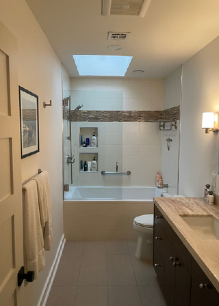
The existing bathrooms were dull and characterless, with standout features like a skylight in the guest bathroom being lost in the bland scheme.
(Image credit: Courtesy of Ome Dezin)
“We always work closely with our clients throughout the process but particularly in the exploration design phase to hear their concerns, needs, priorities and what they may be willing to compromise on,” Jesse and Joelle say. “Here, we updated the look and feel, materials and added medicine cabinets and custom vanities with storage in mind.”
While the design studio focussed on making the spaces practical, with a lack of storage the clients’ main complaint, it was just as important to both the designers and their clients that they introduce purposeful design to the space, something which was entirely lacking before Jesse and Joelle intervened.
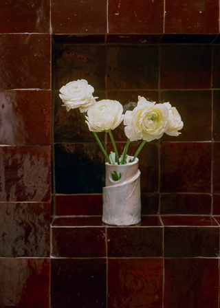
The guest bathroom in particular highlights their ingenious use of color and knowledgeable use of pattern to craft something sophisticated and bold using the latest tile trends. “The guest bathroom was a space where we could have a bit more fun in terms of design, while our clients wanted their primary to feel like a zen space to relax in.”
(Image credit: Austin Leis. Design: Ome Dezin)
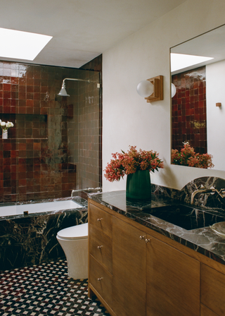
The clients wanted a zen-like atmosphere when contemplating ensuite ideas but the designers were given a little more creative license for this room, resulting in a bold, red-tiled shower enclosure. “We like to mix vintage with new at all of our projects so while a lot of the materials are new we made sure to purchase vintage elements throughout.”
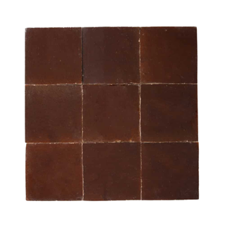
“The Burnt Sugar Zia tiles in the guest bathroom anchored the space and color palette,” the designers describe. “This bathroom color feels opulent, grounding and exciting. The guest bathroom in particular feels like a mix of old world and new.”
(Image credit: Austin Leis. Design: Ome Dezin)
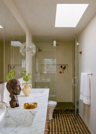
The resulting scheme is rich and luxurious. From the complementary black marble and checkered bathroom flooring, to the burst of oxblood wrapping around the shower, it’s a masterclass in achieving a harmonious design that feels entirely new.
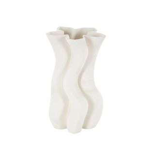
Allmodern Ceramic Ribbed Dimensional Vase
Price: $55
Some organic textures help temper the richer materials of the space. This wavy vase is a fun choice for dressing a countertop.
The Primary Suite
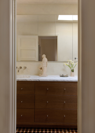
For owners Micah and Freddy, the ensuite had to be somewhere they felt comfortable as it would be used more regularly than the guest bathroom. A lack of storage meant its daily practicality was missing the mark. “The main concern for the primary was storage so we built a custom double vanity with three columns of drawers that visually aligned with 4 deep medicine cabinets,” Joelle and Jesse explain.
For choosing the right bathroom storage ideas, it was a case of finding the appropriate balance between beauty and practicality. “As designers, our focus is always about balancing form & function, how can we make both happen in sync with the final product being a beautiful space,” they say. “Additionally, in the primary bathroom, we installed four medicine cabinets with ample storage for their products. It’s not one or the other, it’s both working together.”
(Image credit: Austin Leis)
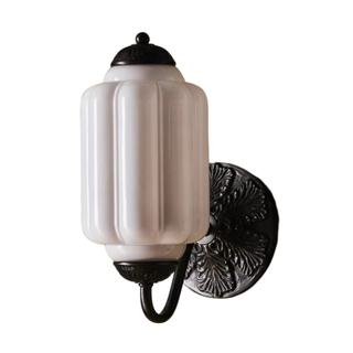
With this in mind, the designers selected small, considered details to give character to the more neutral scheme. The bathroom lights add a touch of vintage authenticity and add a little old-school glamour.
These small additions speak to Jesse and Joelle’s expertise, which, as with every renovation, was tested throughout the project. “Renovation always has its obstacles, mainly in that you don’t know what you’re going to find once you open up walls, so there were some things we could/ could not do because of some existing piping and electrical so we had to re-route some plans,” they remember. “We’re used to this and sometimes outcomes even come out better than planned, you just have to get creative and pivot.”
(Image credit: Tessa Neustadt. Design: Ome Dezin)

