Neutral colors like black, white, and cream are among the most used in home design, and for good reason. From kitchen backsplashes to upholstery, neutrals are timeless and elegant. Not only do neutral colors create a soothing and minimalistic look, but they also act as a foundation for other colorful design elements (like being paired with bolder hues to balance a color scheme). Read on to learn what neutral colors are and how four different hues can make us rethink how we use them in our homes.
What Are Neutral Colors?
Neutral colors are hues that lack saturation and aren’t included on the color wheel. Common neutral colors include white, black, tan, beige, cream, ivory, and gray. While neutrals aren’t on the color wheel, they work to support more saturated primary and secondary colors that are. Popular uses of neutrals paired with saturated tones are black and white with red, cream with blue, and ivory with yellow.
Another characteristic of neutral colors is that their appearance changes with lighting. In natural light, a white wall might appear to have a cooler tone. But in the evening, with lamps and overhead lights turned on, the same white wall can appear warmer, almost with a yellow, creamy tint. This same idea applies when neutrals are paired with more saturated colors—for example, white might look warmer when paired with yellow compared to blue.
Our 4 “New” Neutral Colors
While not traditionally considered neutrals, these four colors can act as foundational hues in a room, similar to white, black, gray, cream, brown, or ivory. Discover how to seamlessly implement these tones into your home without drastic change.
1. Sage Green
Sage green has quickly become a go-to color in home design and decor. The gray-green shade adds a soothing, natural look to busy spaces and provides just enough color to make black-and-white palettes more interesting. The shade easily fits the neutral color criteria as it pairs well with brighter colors, like blue, yellow, pink, and orange. It also complements neutral and earthy tones like cream, brown, and ivory.
How to Use It
Sage green is a subtle hint of natural color that can replace white and ivory elements in your home. Consider painting your kitchen cabinets in sage green paint or swapping out your neutral bedspread for a calming sage duvet.
Matthew Williams
2. Blush Pink
Pink has made a recent resurgence in home decor with the help of trends like cottagecore, Barbiecore, and coquette aesthetics—and we think it’s here to stay. The soft, warm color can replace white and cream when paired with more saturated colors. Popular colors that go well with blush pink include red, green, and deep, jewel tones.
How to Use It
For an easy way to accomplish this color in your home, exchange white and ivory pieces or walls with this elevated shade. If you don’t want to take on this trend completely, add blush pink throw pillows or an accent chair to get a taste of the color first.
Dane Tashima
3. Navy Blue
Navy blue is arguably one of the most versatile shades on the color wheel. It’s popular in countless design styles, including traditional, farmhouse, Art Deco, and coastal. Because of its versatility, navy blue seamlessly replaces darker neutral colors, like black and brown, to complement brighter colors. Where black is technically the absence of color and is used to define spaces, navy blue does the same job while providing a rich undertone of a primary color.
How to Use It
Apply navy blue in your home where you’d otherwise use black, brown, or gray. Try painting your trim this color to make clean lines and define spaces. Or, instead of traditional neutral paint on your walls, color-drench your room with navy to create a calming blank slate for artwork or decorative trim.
Kim Cornelison
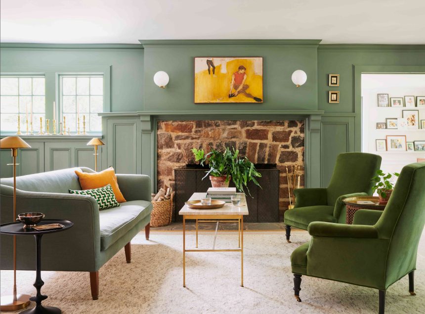
4. Olive Green
Where sage green works as a lighter-toned neutral, olive green works as a darker-toned one. Olive adds warmth and earthiness to a space while serving as a great foundation for other hues. Often paired with other earth tones like terra-cotta, orange, brown, and red, olive green is like a softer, warmer version of black.
How to Use It
Take inspiration from the above photo and paint your fireplace olive green to create a focal point for your living room. Incorporate more of the color with various small touches like throw pillows, accent chairs, and houseplants.