Simon Upton
Unless you’ve been living under a rock – a grey one – you would have struggled to miss the steady emergence of brown as the colour du jour. It’s been gathering momentum for a year or two now but this writer (an out-and-proud lover of every hue from butterscotch to bitter chocolate) would argue that it never went away. Brown is definitely having its moment in the sun but unlike a colour as divisive as say, purple, it feels like a stretch to describe such a versatile and neutral tone as a trend in the first place.
Its fresh new appeal could be linked to the tactile and warm approach to minimalism described by trend forecasting experts WGSN as ‘soulful minimalism’, where cool tones and sharp lines are being replaced by natural materials, texture and a neutral colour palette of warm whites, browns and greens. Or perhaps it’s the strong association between shades of tan and brown and the 1970s, another current trend that we’re seeing in various interior designers’ work and – frankly – all over social media and Pinterest. We don’t mean Austin Powers-esque shag carpets and swirly orange prints. Think tan leather furniture, rich brown velvet, muted abstract art and Yves Saint Laurent’s Paris apartment. All the best parts of the Seventies with none of the hot sweats of garish nostalgia.
After reverting to yet another Instagram poll to gather general thoughts on the hottest colour of the moment, the feedback was overwhelmingly enthusiastic, with most responses championing brown in any which way (“It makes everything look cool”, “I adore it – it’s cocooning and grounding” and “It’s so cosy, earthy and inviting” were some of the many comments singing brown’s praises).
Tim Lenz
There were a few negatives too from people who say the colour reminds them of the contents of a nappy (their words, but it’s an unavoidable comparison in fairness), plus several people who said it brings back too many shuddering thoughts of their parents’ decor in the Seventies and Eighties. A few others simply find it too dark and “boring” to live with and think it would make their home feel dated. But dear reader, don’t shy away from this comforting colour because long after the brown hype is over, it will continue to look timeless. Brown’s liveability is all about how you choose to use it.
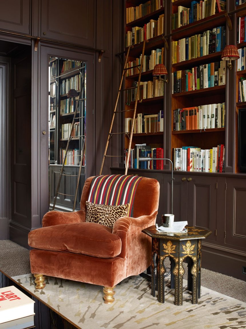
Only use as much as the space can handle
Consider the size of the room you’re decorating and what kind of feeling you want to create – a large room with high ceilings can handle a lot of brown (in any shade) without it creating an overwhelming heaviness, whereas in a smaller space with average ceiling height and no grand architectural features, a dark tone can feel oppressive if there’s a lot of it. In smaller spaces, less is more, so go for gentle accents such as cushions, footstools, artwork or antique pieces of furniture, but use the colour in moderation and lean towards lighter shades of caramel and tobacco if you’re still not sure. The exception to this would be if you’re purposely creating a cosy winter snug, in which case the feeling of a darker, enveloping space wouldn’t be a bad thing, so go forth and complement deep terracotta or ochre walls with chocolate brown velvet curtains and punchy printed armchairs.