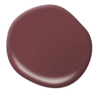
There are a few obvious markers that signal the start of fall – cooler weather, shorter days, and – of course – the onset of color forecasting season. For anyone in the design world, these few months are all about predicting the latest trends set to define the year ahead, and no one takes that analysis quite as seriously as our favorite paint brands.
By virtue of their being, trends are cyclical in nature, but our color preferences tend to move at a faster pace than the likes of material, texture, or form. Each year, around September, leading paint brands announce their chosen shade to represent the mood of the moment during our next circle around the sun – the so-called “color of the year“. But why do they bother, and how do they choose them?
Clever marketing aside, there are some really interesting reasons why color forecasting comes around every year, and it has a more wide-reaching impact than you probably realize. To find out how this increasingly common practice really works, we asked some of our favorite paint brands to offer some insight into the inner workings of their color forecasting methods. Here’s what we found out.
What is color forecasting?
Valspar’s Color of the Year 2025, “Encore”
(Image credit: Valspar)
The color experts who work for leading paint brands really are the best in the business. They always have their finger on the pulse when it comes to emerging color trends, using external factors like cultural moments and societal shifts combined with consumer data and analysis to build a vision of our decorating habits. Think of them as the soothsayers of the world of chroma. This is the phenomenon known as color forecasting.
Color experts never stop forecasting, but as we enter fall and turn our attention to the year ahead, most paint brands pinpoint a shade they believe will define the new year. The so-called “color of the year” has a huge influence on the way we decorate, but there are – of course – plenty of chosen shades each year, all from different brands. There are typically some recurring threads – be it neutrals, warm tones, or color families (2024’s predictions centered largely around blue) – but there are outliers, too. And even when those specific shades don’t have a huge presence in our future of decorating, they still influence many of our design decisions (and the color trends that follow).
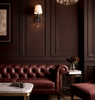
C2’s Color of the Year 2025, Raku
(Image credit: C2)
The relationship between these specific hues and the trends that follow is twofold; the color of the year is chosen from detailed analysis and emerging decorating trends, but that particular shade also has a huge impact on the colors that come after. You could argue that “color of the year” announcements create a manufactured trend landscape, but they nevertheless have a huge real-world influence on how we decorate with color.
“Designating a Color of the Year offers consumers confidence during the color selection process and invites them to be inspired,” says Behr’s VP of Color and Creative Services, Erika Woelfel. “Color of the Year allows Behr Paint the opportunity to highlight a color that is poised to plan a leading role in interior and exterior paint projects in the coming year.”
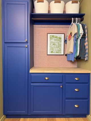
(Image credit: Kyle Ortiz)
According to Erika, a Color of the Year can often turn an unsuspected color into a “staple in a space simply by sharing the experience a certain color can provide”. “For example, Behr’s 2025 Color of the Year ‘Rumors‘ was selected to encourage consumers to make a statement and add a pop of color into their homes,” she says.
As Erika alludes to, besides the systematic and scientific aspects of color forecasting, the aim is to inspire homeowners’ paint ideas. “Our Color of the Year aims to provide strategic color direction, stimulate innovative home design projects and showcase creative solutions for consumers as they create the home of their dreams,” says Sue Kim, director of color marketing at Valspar. “It influences up and coming interior design trends and sets the tone for the year ahead while establishing spaces of greater joy and creativity.”
How do paint brands choose a color of the year?
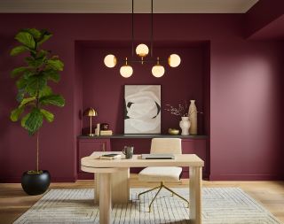
(Image credit: Behr)
The far-reaching significance of the colors of the year can be felt everywhere, from decor to fashion and everywhere in between, but how do the brands decide on a particular hue in the first place, and how do they ensure they don’t choose color trends going out of style?
Large color corporations like Pantone are widely considered industry leaders, but most paint brands announce their chosen shades way before the likes of Pantone make their annual predictions known. Well, according to Sue, the main drivers come from cultural shifts outside the world of interiors.
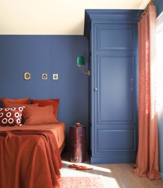
“Each year, Valspar’s team of color, design and style experts selects the Color of the Year by drawing inspiration from a variety of lifestyle trends ranging from iconic pop culture moments to interior design breakthroughs,” she says. “By using this holistic, consumer-centric approach, Valspar identified that this year, homeowners are looking for an enduring color that stands the test of time and infuses excitement and playfulness into the home.”
(Image credit: Benjamin Moore)
Erika and the team at Behr noticed a similar trend in their consumer research which also influenced their choice for Color of the Year. “We noticed a shift of people looking to incorporate more personality and depth into their home, whether painting the whole wall or adding a subtle, sophisticated accent,” she says. “New research conducted by BEHR Paint reveals that three-quarters (76%) of Americans would consider painting a room or wall a shade of red and 73% of Americans say a red paint color can add depth and character to living spaces.” With that in mind, they selected a deep red shade that could be a “confident anchor” within a room, while still complimenting neutrals.
Color forecasting blends evidence-based research, trend-led ideas, and clever marketing strategies to curate a chromatic palette that inspires our decorating habits year after year. Color of the year announcements are only in their infancy (most were established in the last 15 years) but it’s already hard to imagine a world without such an influential moment on our design calendar. We’ll be counting down the days until the next big reveal. In the meantime, we’ll be dusting off the paint brushes.


