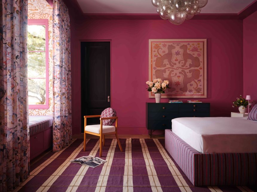
Color of the Year season is that magical time of year when paint companies gaze into their crystal balls and crown a hue as the one to watch in the new year. It’s an exciting time, but it’s often hard to find common themes among the many suggested colors. This time around, though, a clear frontrunner has emerged.
For 2025, a handful of paint companies have predicted that purple will take over our walls, ceilings, and trim. They may differ on the exact shade, but the message both from brands and interior designers is clear—purple is here to stay, and will make a bigger impact than ever in the coming months.
The New Neutral
Photography by Michael Clifford / Interior Design by Ward + Gray
Purple doesn’t have to be a bright, neon color that looks like it’s been ripped from the pages of a children’s book. The purples that are trending now are often softer and more subtle, making them incredibly versatile. “People are gravitating towards this color because it can be a little bit of everything,” says William Cullum, senior designer at Jayne Design Studio. “It can feel like a neutral—think mauve—or it can be supersaturated and jewel-toned, like a rich magenta.”
Katibelle Sharkey, creative director of BAS Stone, even goes so far as to call purple the “new neutral” of interiors. “It appears in everything from veined marble to cabinet finishes,” she adds. “We anticipate purple staying strong in 2025.”
Why Now?
Photography by Lindsay Brown / Interior Design by Annie Downing
So what’s making purple so popular now? For a while, the color was considered a bit dated, harkening back to the all-over purple rooms that were popular in the ’70s. Its resurgence in the 21st century is a reaction to other color trends that have dominated the new millennium. “There’s an exciting shift away from all-white, creamy tones toward embracing bold, saturated colors—like rich shades of purple—that bring personality and character to a space,” says Kristin Harrison, founder and principal designer of Bungalow 10 Interiors. “Personally, I welcome this change.”
That’s not to say that neutrals like whites, browns, and grays will disappear entirely—but there’s certainly an appetite for more ambitious, colorful interiors. “The pendulum is swinging away from the light, bright neutrals that have been dominating for years,” says interior designer Annie Downing. “People are bored and eager to take risks.”
William Cullum, Senior Designer at Jayne Studio
I think after seeing so much gray and cream, we’re all excited for real colors, It’s something special and unique that hasn’t been done over and over.
— William Cullum, Senior Designer at Jayne Studio
The Official Color of the Year
Courtesy of Glidden
Interior designers aren’t the only ones who are betting big on purple—as mentioned, many of the paint companies selected a similar shade for their Color of the Year next year. Benjamin Moore chose Cinnamon Slate for its Color of the Year, a light plum with brown undertones that perfectly fits the purple-as-a-neutral mold. Glidden selected Purple Basil, a similar tone that’s a bit more saturated, with notes of aubergine. Minwax chose Violet—which looks just like it sounds—and Behr’s earthy, mauve-meets-red Rumors even has some purple undertones.
“Purple embodies the duality people are craving right now—it’s bold yet soothing, and modern yet timeless,” says Downing. “Paint companies are responding to our collective desire for spaces that feel personal and layered.”
How to Use It
Photography by Kirk Douglas Swinehart / Interior Design by Jayne Design Studio
To some, purple can seem intimidating—it’s not as approachable as a warm brown or a rich terracotta. Plus, there’s a wide range of shades to choose from—from light lavender to rich aubergine. Thankfully, interior designers have already used this popular color plenty, and have a few recommendations.
“Using it as a color wash on walls or ceilings instantly makes a space feel intimate or moody,” says Staver Gray, co-founder and principal of Ward + Gray. “In contrast, adding it as a pop of color in a lighter space helps ground the design, while maintaining brightness.”
Since purple can take so many forms, it can look beautiful in many different rooms and scenarios. “It has an across-the-board application—there are so many varieties, so you really can’t go wrong,” says Cullum. “In our apartment, I used Benjamin Moore’s Beach Plum in the living room. It’s a frothy lilac color.”
Downing even breaks it down room by room, noting that lavender works well in bedrooms and bathrooms for a more tranquil atmosphere, and a rich aubergine is perfect for dining rooms and libraries. “I think after seeing so much gray and cream, we’re all excited for real colors,” adds Cullum. “It’s something special and unique that hasn’t been done over and over.”


