A perfect version of any room should see it being multi-functional, and nowhere is that truer than a living room. It needs to be able to work as an intimate, private, and personal space while also being the place you have your friends over to, with enough seating so that no one is perched on the back of a sofa. But also not so much that when it’s just you and your book or the dog and the TV it doesn’t feel like you’re in an otherwise empty airport lounge.
Really, you should be able to have a meeting and a rave in the same space, allowing you to be serious or to dim the lights, turn the music up, and get a little drunk.
So how can a living room layout do both? The perfect number of seats is five, with the option of a couple more coming from flexible options like stools that double as ottomans, or fireplace fenders with cushioned tops, anything that can be requisitioned the few times you have a full house.
An award-winning interior designer, Christian, who hails originally from south Africa, worked with designers Turner Pocock before starting his own practice. His designs are elevated, borrowing from classicism, but with a distinctly modern flourish.

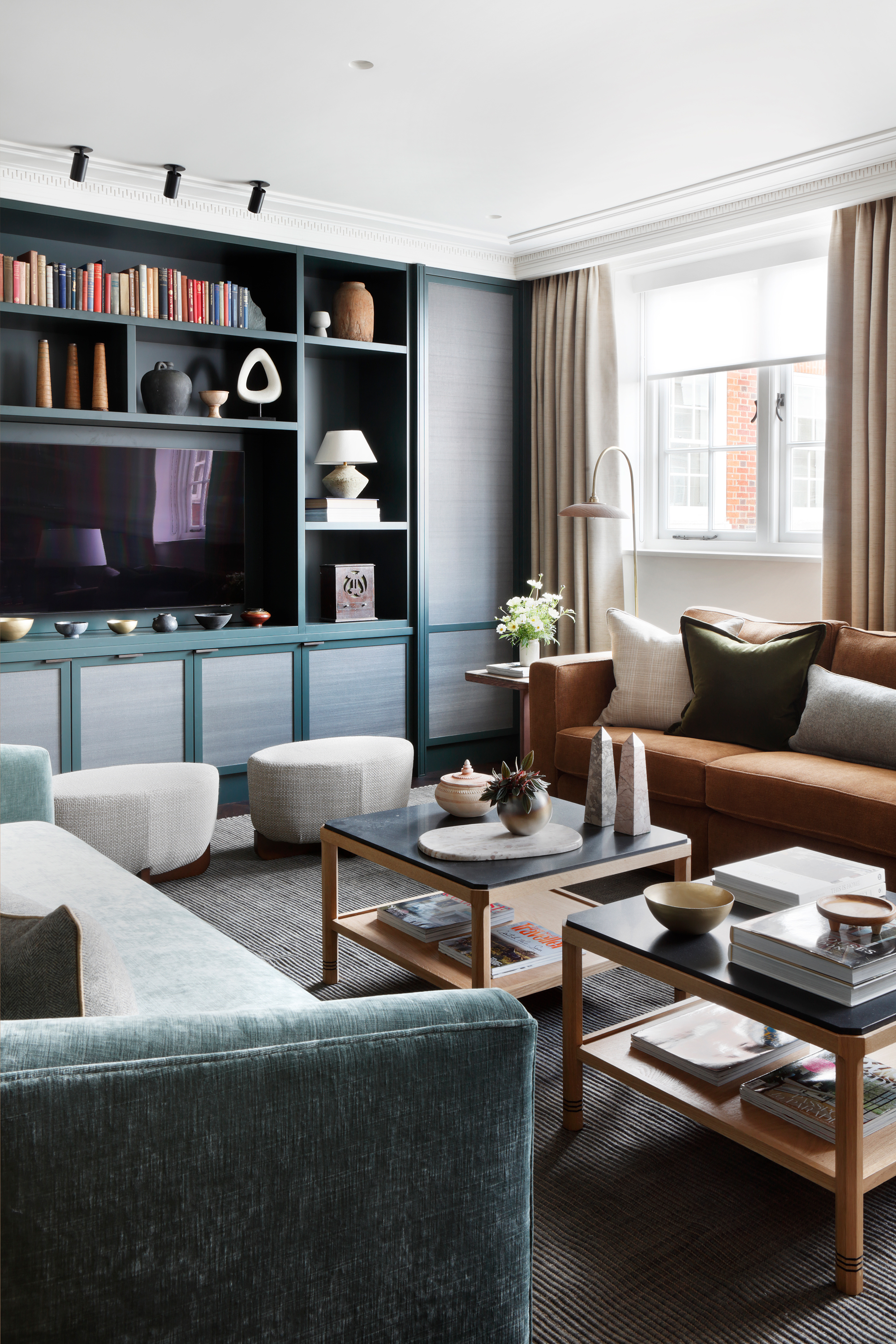
Small ottomans round out the seating of this living room designed by Christian.
(Image credit: Alexander James. Design: Christian Bense)
Don’t be scared about how close together the seats are — proximity leads to intimacy and if you have living room furniture on which people can sit side by side and facing each other you allow for moments of breakaway conversations as well as wider group chats.
What you don’t want is a three-sided living space, where everyone is directed at a fireplace or television. A day bed or ottoman on that fourth edge doesn’t block the view towards whatever is on that wall, while offering another opportunity for relaxed lounging.
Lorfords is good for sofas that bridge the line between classic and contemporary, creating that ambience that is so lovely for a living room, while Rose Uniacke’s fabrics don’t feel too vintage or too modern, instead offering base line of neutrals that you can layer your personality on top of.

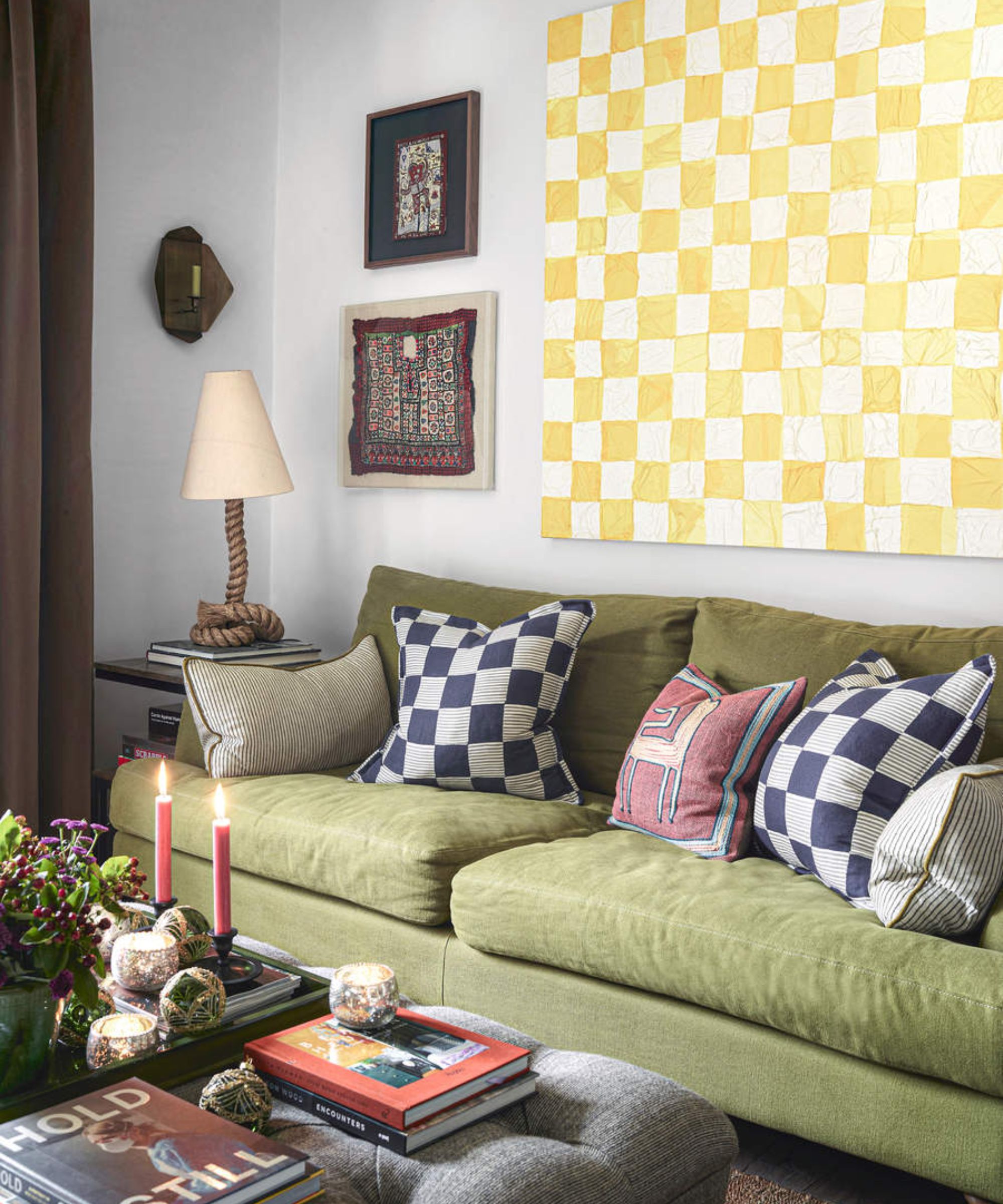
This sofa is perfectly pitched for creating a welcoming atmosphere for this living room.
(Image credit: Mary Wadsworth. Design: Christian Bense)
In fact, neutrals are a good idea for living room walls. Off whites are ideal for rooms that are filled with furniture and so have a cluttered visual surface. I’d suggest taking the ceiling ever so slightly darker, killing the horizon to really bring your eyes and heart into the centre of the room, perhaps Paint and Paper Library’s Slate II on the walls and Slate IV up above.
Then the furniture I choose is saturated but not bright — deep colors that don’t shout, taking inspiration from nature. Dark greens and browns for the bigger pieces, a one-color rug in something a little warmer like eucalyptus or ochre or jute. Then the accessories and art introduce more random pops of brighter shades, so that nothing feels too pristine.
And just as with space for five bums on seats, so you’ll ideally has five sources of living room lighting. Overhead, wall, floor lamps, table lamps and task lighting. The more the merrier, really. This way you can highlight portions of the room, making it wide or small depending on how you are using it, with tiny reading corners or bathing a party in a warm glow. Not that the overhead light always has to be central — hang them in the corner, which makes them feel much more like an installation, and you’re more likely to actually turn them on.
Really, any good living room should be about balance. Formality and informality, a space to find peace and to have fun, to be introspective or extroverted. A room for every side of who you are.


